
Tiyana Telo

Project Description
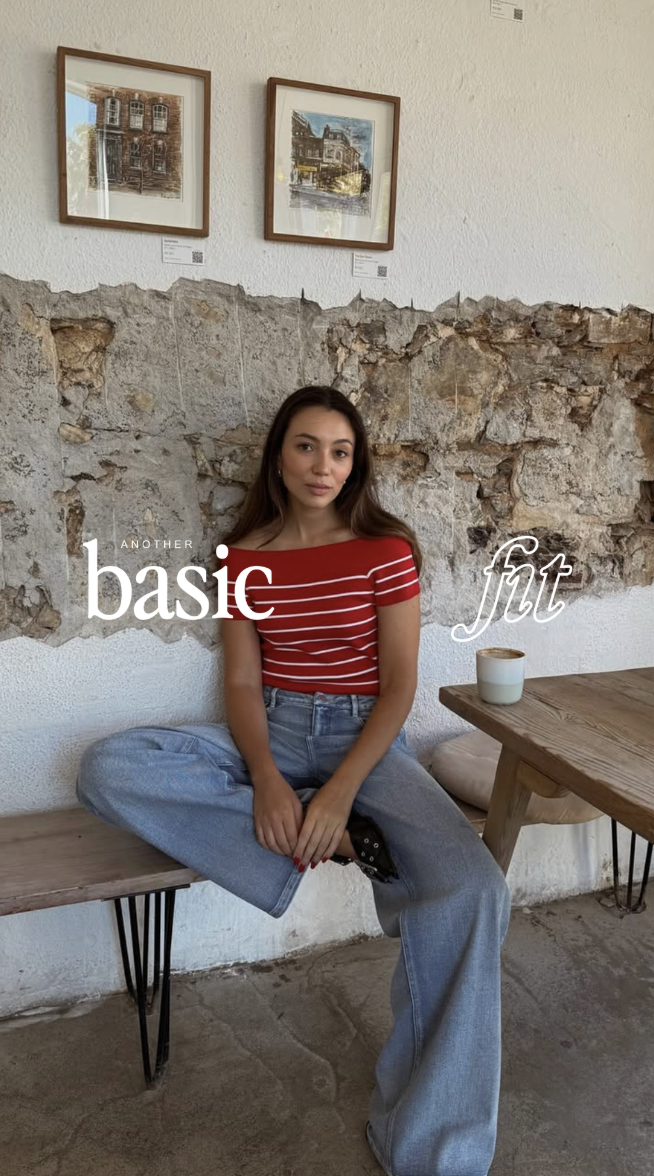
Tiyana Telo is a lifestyle and fashion creator known for turning everyday basics into something effortlessly cool, wearable, and aspirational. Through her signature series, Another Basic Fit, she cultivates a community around attainable style — the kind that feels grounded, unfussy, and rooted in confidence. Her content merges editorial polish with a relaxed, lo-fi visual language, giving her audience a blend of comfort and sophistication. The brand identity needed to capture this duality, positioning Tiyana as both relatable and distinctly stylish in a saturated creator landscape.
Challenge
The challenge was creating a brand identity that elevates Tiyana’s aesthetic while remaining true to her approachable personality. Her brand sits at the intersection of girl-next-door warmth and creative vision — someone who inspires without intimidating, and who makes everyday fashion feel intentional rather than extravagant. The identity had to feel clean, feminine, and timeless, but also bold enough to stand out across platforms. It needed to reflect her point of view: quiet confidence, minimalism with character, and a subtle editorial edge.

Approach
My approach focused on understanding what makes Tiyana’s presence compelling — her relatability, her simplicity, and her undeniable eye for style. The visual direction explored a mix of classic and contemporary influences, using refined typography, warm neutrals, and understated details that echo her effortless aesthetic. A gentle use of contrast, elegant letterforms, and a touch of bold colour became the foundation of the identity. Every choice reflected the idea that “basic” can be intentional, curated, and confidently minimal.

Solution
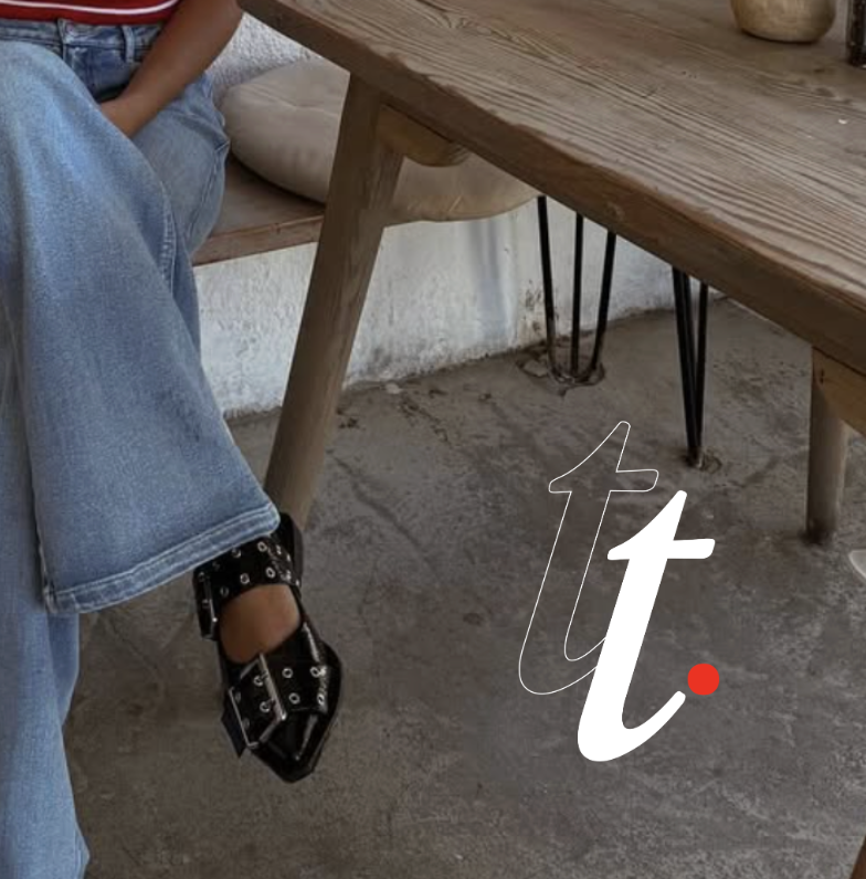
The final identity is polished, editorial, and unmistakably Tiyana. The primary logotype pairs a graceful serif with a subtle accent, creating a mark that feels both soft and assertive. The secondary and tertiary variations provide flexibility for social platforms, series branding, and content overlays. A delicate, italic-leaning monogram extends the brand into smaller touchpoints, giving her a symbol that feels personal and instantly recognisable. The visual system — warm tones, gentle contrast, and structured layouts — mirrors Tiyana’s style philosophy: accessible, elevated, and effortlessly chic.