
Fort Infinity
Project Description
Fort Infinity is an events and artist management brand built around cultural expression, collaboration, and the elevation of emerging talent across Africa. Their work blends music, art, and community, creating event experiences that transport audiences into new cultural worlds and give artists the support they need to grow. The goal of the rebrand was to reposition Fort Infinity as a pioneering force within the African entertainment landscape — bold, dynamic, and rooted in creative ambition.
Challenge
The brand needed an identity that could communicate its dual purpose: a nurturing, aspirational environment for artists looking to develop their craft, and an energetic, memorable presence for event-goers seeking connection, excitement, and self-expression. Fort Infinity wanted to attract emerging artists who crave guidance, visibility, and community, while also appealing to a youthful audience drawn to nightlife, culture, and immersive experiences. The existing brand lacked the clarity, confidence, and originality required to stand out in a crowded industry and did not reflect its long-term vision of becoming a leader in African entertainment.


Approach
My approach was grounded in understanding Fort Infinity’s personality — ambitious, collaborative, expressive, and culturally vibrant. The identity strategy was built around ideas of creative elevation, cultural fusion, and the power of collective artistry. I explored how the brand could visually communicate its supportive, community-focused ethos while maintaining the boldness and confidence needed to compete at scale. The visual direction drew from African futurism, rhythm, movement, and contemporary youth culture. I developed a system where typography, colour, and form could work together to create a strong sense of place and personality, allowing the brand to thrive across digital platforms, physical events, and artist campaigns.
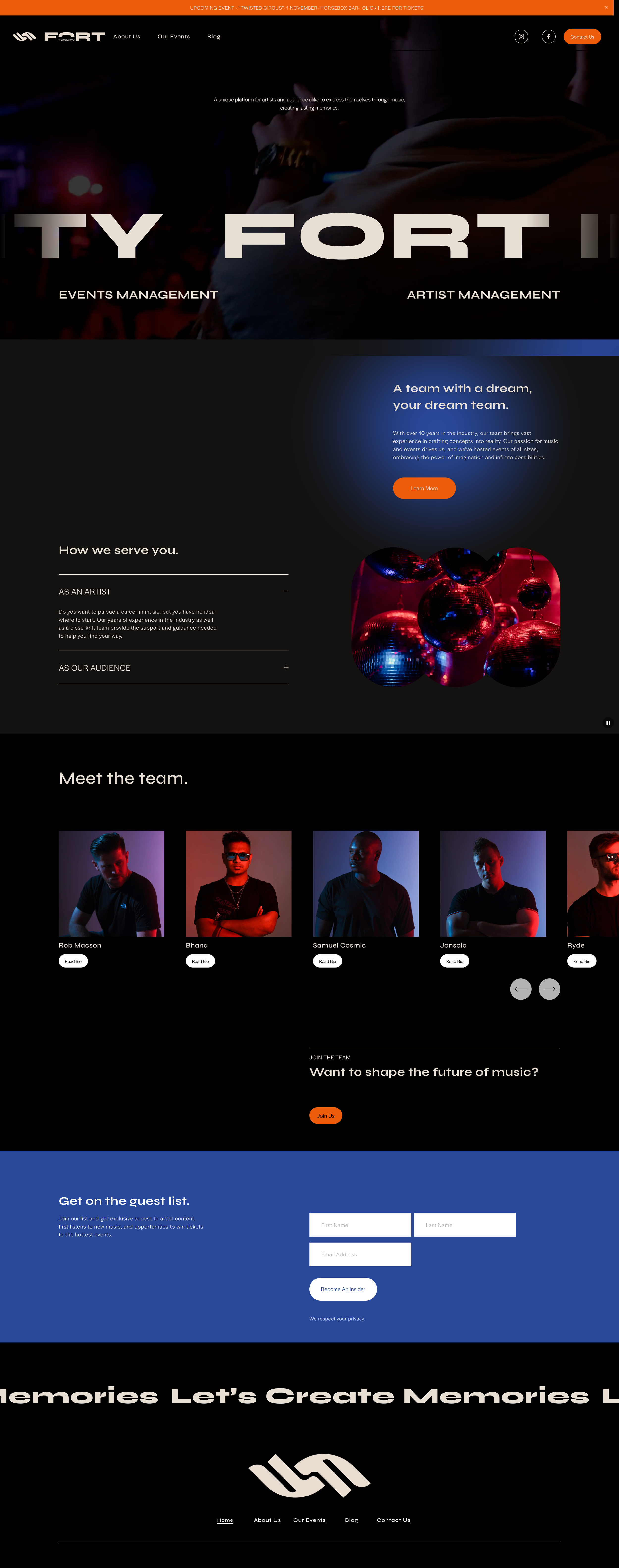
Hover to view homepage
Solution
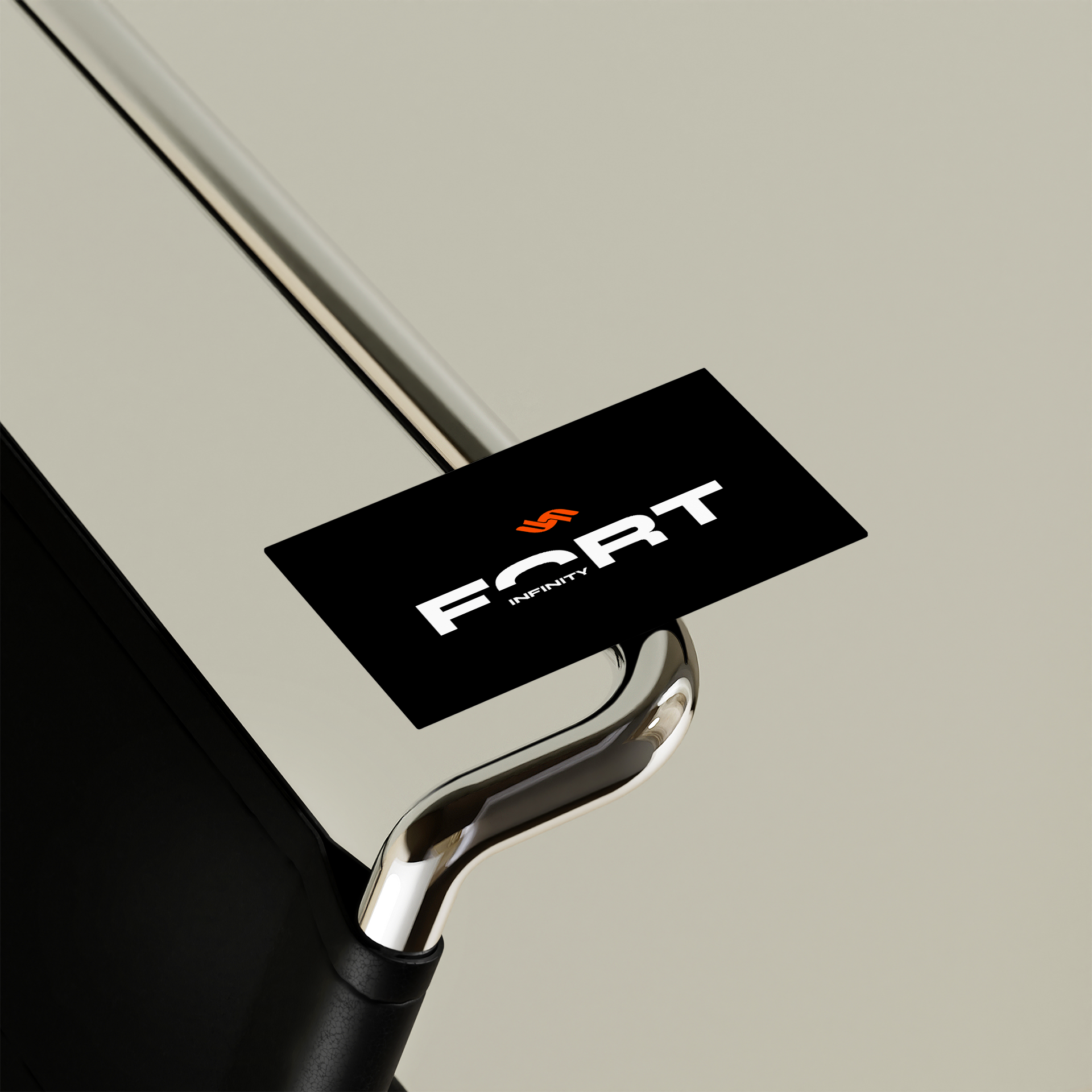
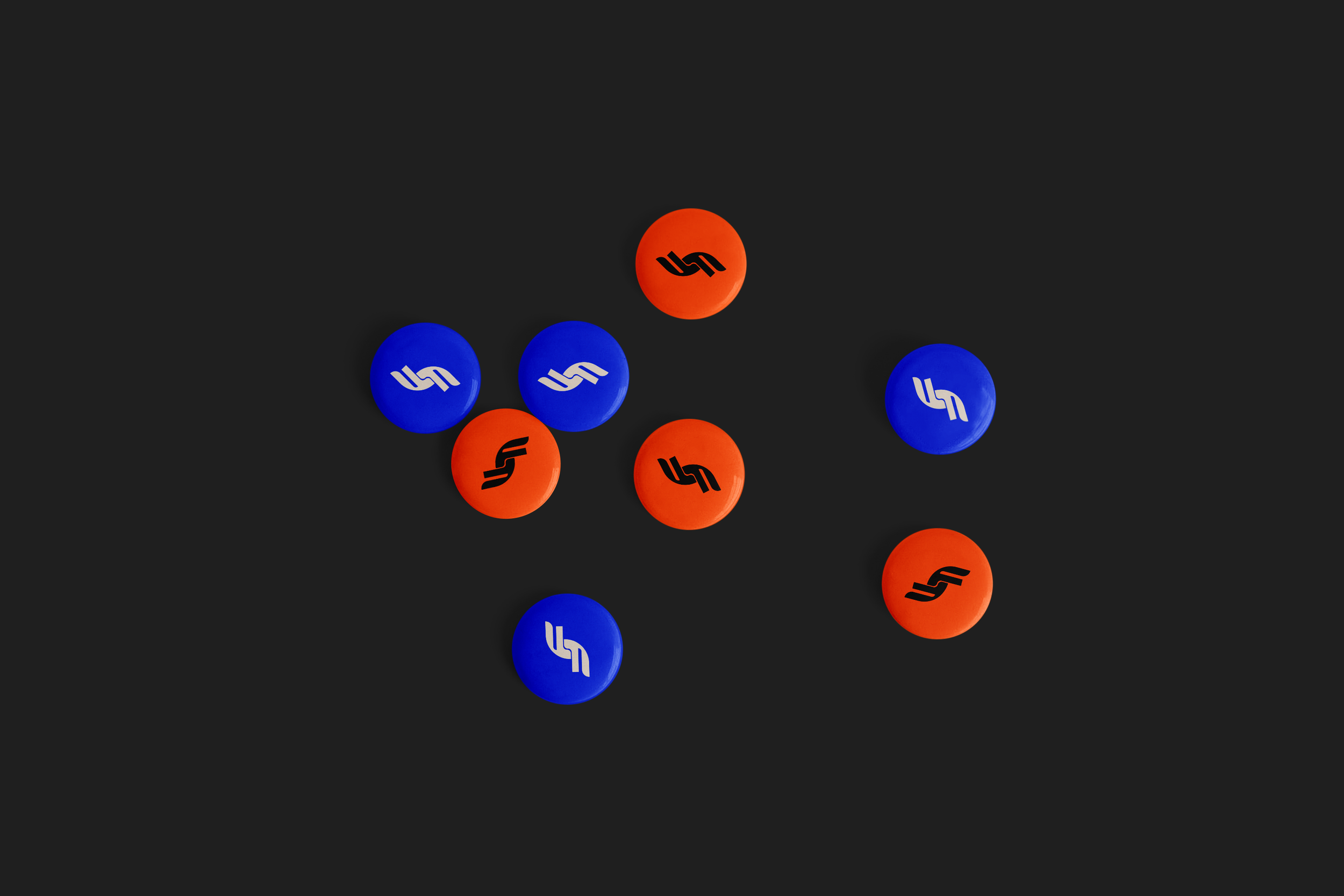
The final identity captures the essence of Fort Infinity — bold, dynamic, and deeply rooted in cultural expression. The logotype reflects forward motion and ambition, while a modular visual system introduces forms inspired by unity, rhythm, and limitless creative potential. The colour palette balances vibrancy with professionalism, giving the brand both energy and clarity. Layouts were designed to feel expressive and expansive, allowing artwork, artist features, and event photography to take centre stage. The updated brand voice mirrors this visual energy, speaking to artists and audiences with confidence, warmth, and purpose. Together, these elements form a flexible brand ecosystem that feels modern, rooted, and distinctly African.